
A new look, how our residents shaped the Aura brand refresh
A new look, how our residents shaped the Aura brand refresh A brand refresh can easily become a conversation about logos, colours and typography. For us, it started with a much bigger question: What do people really want from retirement living today? Earlier this year, the team set out on a research project with one […]
A new look, how our residents shaped the Aura brand refresh
A brand refresh can easily become a conversation about logos, colours and typography.
For us, it started with a much bigger question: What do people really want from retirement living today?
Earlier this year, the team set out on a research project with one simple goal: to genuinely understand how our residents and broader community feel about Aura, and what they’re really looking for when they think about where to call home.
We started with a survey, reaching both current residents and people considering the move. More than 600 people shared their thoughts — honestly, openly, and with a lot of heart. From there, we ran five focus groups to explore the themes that kept coming up, digging into the words, images and feelings that resonated most.
250+ Residents surveyed across all villages
6 Villages represented in the research
350 non-residents surveyed
5 focus group sessions
The findings challenged many of the assumptions that exist within our industry.
One insight stood out above all others: people weren’t afraid of moving home. They were afraid of losing who they are. Identity, independence and dignity mattered far more than convenience or “ease”.
We also discovered that words matter.
Participants connected far more strongly with the word “home” than with terms like “residence”, “lifestyle” or even “retirement living”. They spoke about wanting space, privacy and somewhere that still felt like their own.
Community was another interesting discussion.
People valued connection, but they didn’t want it to feel obligatory. They wanted neighbours, friendships, and support available when they wanted it; not a lifestyle they felt pressured to participate in.
Perhaps one of the biggest opportunities was around privacy. While community is often the front and centre of retirement living marketing, our research showed that private space and the ability to maintain independence are just as important but rarely acknowledged.
The research also reinforced something we’ve always believed: Trust is earned through honesty.
Participants consistently preferred straightforward, respectful language over marketing buzzwords. Transparency around contracts, fees and financial arrangements was just as important as beautiful homes and amenities.
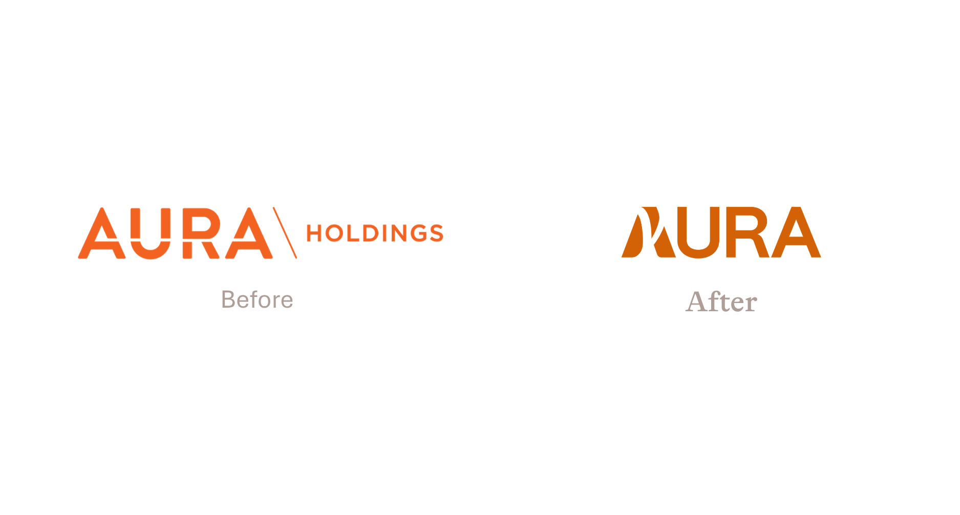
Every finding found its way into the refresh. The tagline — A home that works for you— came directly from what people told us they wanted to feel. The warm, grounded colour palette was informed by participant survey preferences. The vocabulary we use day to day, the photography direction, the tone of voice — all of it is shaped by real conversations with real people.

Our previous messaging centred around bringing back the simple life. Creating communities filled with connection, familiarity and a sense of belonging reminiscent of the good old days. While that feeling remains an important part of who we are, our message is evolving to reflect what retirement living also means today: choosing a home that works for you.
Retirement isn’t about starting over. It’s not a new identity or a smaller life. It’s about keeping what makes you, you, choosing a home that supports your lifestyle now, gives you more freedom, and allows you to hold onto the things that matter most while letting go of what no longer serves you.
Many residents told us they wished they’d made the move sooner. Once they’d settled into their new community, the benefits far outweighed the fears that had delayed their decision.
That reminded us that our role isn’t simply to build beautiful communities. It’s to communicate in a way that reduces uncertainty, builds confidence and helps people make one of life’s biggest decisions on their own terms.
The new brand is beginning to roll out now, and you’ll see it gradually come to life across our website, materials and villages over the coming weeks.
While the visual identity is new, the thinking behind it has always been the same: listening first.
A huge thank you to every resident and community member who took the time to complete our survey or participate in our focus groups. Their honesty, experiences and insights have shaped the future of Aura in ways that go far beyond a new logo.
This refresh belongs just as much to them as it does to us, and we are proud to share it.
Updated – 1st October 2026


